
Hello to all of our crafting friends, Antony here on behalf of 2 Crafting Minds.
Well both myself and Samantha are pleased once again to share our blog
with another fellow crafter. This time we have the very talented
Amanda Mcleod. Amanda loves crafting as well as writing poetry and
runs her own Facebook craft group page as well... I'll hand over to her to introduce
herself and her beautiful canvas. Thanks for letting us share your
work Amanda!

HI everyone, My name is Amanda and arts and
crafts are my absolute passion. I am a member of
Sheena's Ink-ettes group and regularly show cards
and crafts using Sheena's amazing products and
I also write poetry pieces based on Sheena's new
collections which I love doing. I was so excited when
one was read out on Hochanda!
I have always crafted in some way since I was a
child and really enjoy making cards and journals.
I have a small website where I sell my crafts and
cards (www.theatticrooms.co.uk) and a Facebook
page called The Attic Rooms. I also set up a
Christmas card making group on Facebook called Make One
Christmas Card Every Week Throughout 2017 which I love running,
along with a team of 5 other ladies. I have just started trying out
canvases having been inspired by Samantha's amazing art pieces.
Samantha has given me so much confidence since I met her over
on the Sheena page and she has really helped me to progress
and push myself to develop new ideas and new techniques.
This is only my second canvas and it's one of the few times when
the image I saw in my head was able to be transferred onto the artwork.
Not often it happens that way! Thank you to Antony and to Samantha for
allowing me to share their space for this blog!
Products used to make this project - 16" x 12" pre-primed canvas from eBay
A selection of paints including -
Pebeo deco creme in 32 Matt Fir Green
Pebeo deco creme in 34 Matt Olive Green, Reeves acrylic in Terracotta
White Pebeo paint for snow splatter effect,
as well as Flowersoft Polar White
as well as Flowersoft Polar White
A wide selection of Tim Holtz distress inks for colouring the foliage
Pinflair Glue Gel for affixing all the elements to the canvas
Spectrum Noir Colourblend pencils and blending solution
Sheena's white card 300gsm for die cutting

The vision and idea behind 'Solstice'
The original seed for the idea of the Solstice piece was started after I
had made this card for my Christmas card making group, 'Make One
Christmas Card Every Week Throughout 2017' - (MOCCEWT) for short!
I've always loved the whole solstice mythology story and the cyclical
battle between the Oak and the Holly King and their endless struggle
to dominate the seasons and wrestle power one away from the other
at Midwinter and Midsummer. So making this card really sparked the
whole idea for a more substantial piece of art.
Step 1 I started out with a plain, white canvas which
measured 16" x 12" and which was primed with a coat of Gesso.


Step 2 I then coated the entire canvas with a sponged
background of green and brown paints. I intended to cover
th entire canvas with foliage but wanted a 'forest green'
background should any small areas of canvas remain visible.
These are the three paints which I applied, very roughly and
completely randomly over the whole canvas.
background of green and brown paints. I intended to cover
th entire canvas with foliage but wanted a 'forest green'
background should any small areas of canvas remain visible.
These are the three paints which I applied, very roughly and
completely randomly over the whole canvas.


Step 3 The Oak King and The Holly King faces were made
from air dry clay by hand. I wanted to give the impression of
faces growing from within a living tree so they are both surrounded
by twisting branches. I applied bark like texture to The Oak King's
face to further this impression. Here are the clay pieces in their
from air dry clay by hand. I wanted to give the impression of
faces growing from within a living tree so they are both surrounded
by twisting branches. I applied bark like texture to The Oak King's
face to further this impression. Here are the clay pieces in their
early stages.


Here are the masks after being painted with Pebeo paints.
I purposely wanted the Oak King to have sleepy looking eyes.
Is he just awakening to rule the Spring and Summer or just
going to sleep and handing over his dominance to the Holly King?
I wanted the viewer to decide!

Step 4 I then began the process of a HUGE amount of
die cutting, stamping, colouring and shaping for a whole
variety of foliage, flora and fauna. I used Sheena Douglass's
Perfect Partners ranges which included, ivy, oak leaves,
holly, pine branches, brown twig branches, berries and
brambles, florist's friends, snowdrops, bluebells, a squirrel,
a Kingfisher and a Robin and mushrooms. I also added
some dragonflies, butterflies, maple seeds (helicopters!)
frogs, a spider, a handmade web!, some mistletoe, and other
natural elements which were foraged from Golden Acre Park in
Leeds such as the acorns and pine cones.
Step 5 The pieces were then layered really thickly and
built up slowly, to create a really lush foliage covering. I wanted
to create a Spring/Summer side for the Oak King and an
Autumn/Winter side for the Holly King so created two very
separate sides which blend and merge in the centre.

A close up of the Oak King's side.

A close up of the Holly King's side.

Step 6 My favourite part of the whole piece, the
butterfly on the Oak King's nose! You can really see the
texture on his nose in this photo,' and his sleepy eyes.
The Bluebells are also a favourite part too. I love the splash of
blue in amongst all the green foliage.
One side of the Oak King has fresher green/yellow leaves and
I aged them down into a more brownish hue where he meets his
rival, the Holly King. Can you see the little brown frog?
I aged them down into a more brownish hue where he meets his
rival, the Holly King. Can you see the little brown frog?

Step 7 A close up on the Holly King. I really like how his
eyes appear to be gazing off to the left and upwards as this
was a complete accident but I like how this looks! I added
berries for a splash of colour as this side is more Wintery and
has a much darker feel. There is also a touch of white
flower soft added very sparingly to suggest the
beginnings of the Winter frosts.


Step 8 A closer zoom into the Oak King's domain.
Here you can see the dragonflies which I cut from vellum
to suggest the gauzy feel of their delicate wings. The
Kingfisher was coloured with Spectrum Noir Colourblend
pencils and I used blending solution to get a lovely smooth
finish. The little squirrel can just be seen peeping through
the foliage and the lovely fresh leaves of the brambles.

Step 9 A close up of the squirrel. He was coloured using
the same pencils as the Kingfisher. He appears to be studying
the butterfly intently! You can also see the lovely, purple
berries and a red mushroom in this shot and the maple
seed heads which I can remember throwing up into the
air when I was a child. We used to call them helicopters
because of the way they spun as they came hurtling
back down! I overlapped the foliage across the edges
of the canvas to keep the look softened at the edges.

Step 10 Up above the Holly King's head, the Robin
is perched in bare branches that are laced with a touch
of frosts, foraged pine cones and pine branches. This
part represents the coming of the Winter time.
The Robin was also coloured with Spectrum Noir
Colourblend pencils. You can see the mistletoe closer
here too. One of my favourite elements of the Winter side.

Step 11 A close up of the mistletoe and the spider, who
is just beginning to spin his web. I made the strands for
the web using white embroidery thread and then used
Glossy Accents to create 'dew drops' on them. The
plastic spider was donated to the art work by my son, Ben,
aged 8, who kindly raided his Halloween supplies for me!
The spider was just perfect!

Step 12 A close up of the mushrooms. These were from
the Sheena Douglass set, 'A little bit magical' and were
coloured using the same pencils as before.
the Sheena Douglass set, 'A little bit magical' and were
coloured using the same pencils as before.

Super close up of the Oak King!

Super close up of the Holly King!

Super close up of the Kingfisher and a dragonfly.

A super close up of the Robin. I added a tiny splattering of
white Pebeo paint to this area to suggest the coming of Winter snows.
The frost was created with Flower Soft.

A super close up of the mushrooms, snowdrops and
the 'dew drops' on the spider's web.

A super close up of the green frogs and the snowdrops.

A super close up on the bluebells and the brambles.

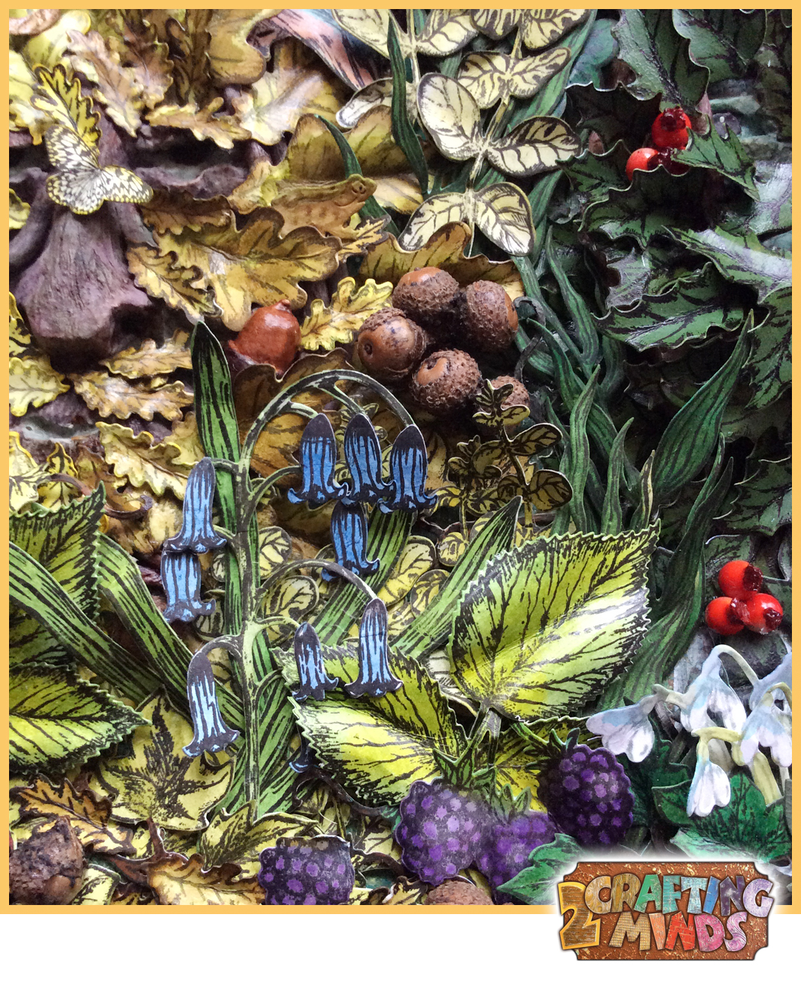
Two more close ups. The vellum dragonfly at the top and a wider angle of the bluebell area at the bottom. The acorn which is nestled into the Oak King's face is made from clay.

Thank you so much for the post Amanda, our jaws are still
on the floor. What a wonderful story behind the canvas too.
If you have time, please take a look at the short music video I created,
which shows the canvas up even closer.
Since Amanda did this blog post for us, Sheena has invited her
onto her Design Team known as the Inkoids! Well done and
congratulations!
Hope you've all enjoyed Amanda's post and tour of her amazing
canvas as much as we did!
Until next time, Happy Crafting!
and our Guest Blogger Amanda


